I inherited a complex
problem in motion.
The Lab Management System is an internal application built to replace two outdated legacy systems used to manage and track dental restoration cases across the lab. I was brought in to take over one of Glidewell's largest ongoing initiatives.
Before my arrival, the UX team had explored improving the return entry workflow — specifically, shifting return initiation from internal data-entry users to the customers themselves (dentists). They conducted research and built a robust solution. But with other priorities taking over, the feature was put on hold indefinitely.
When I joined, the deadline was approaching fast. The original scope was no longer feasible. My job was to revisit the shelved work, understand what was still valid, and redesign a scoped version that could actually ship.
Scope it down.
Ship it right.
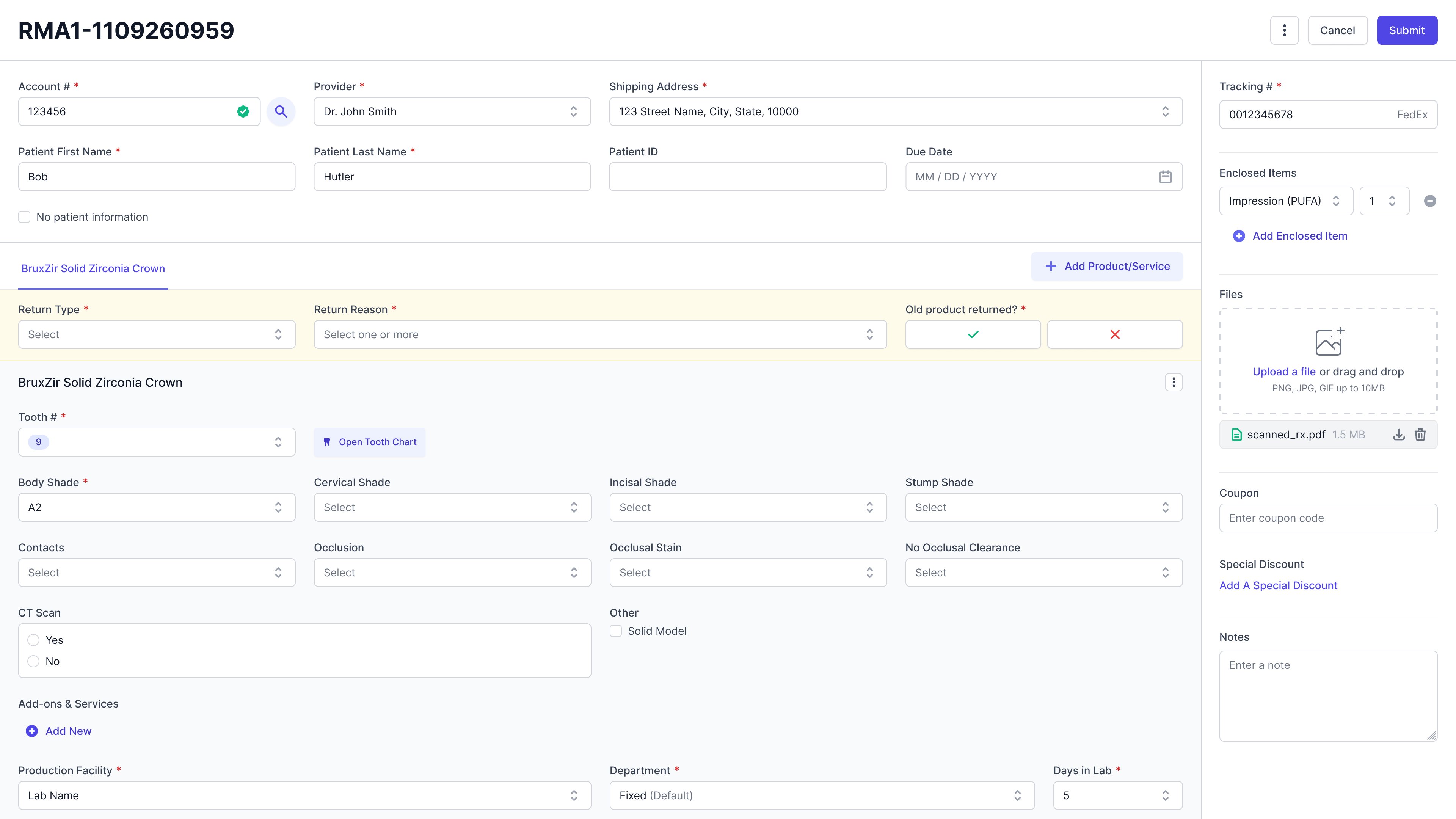
Redesign the return process to support data-entry users in manually entering returns at case entry — maintaining a familiar workflow from the legacy system while adapting it for the new LMS platform.
I had the least context
on the team. So I
went and got it.
As the newest member, I had the least familiarity with both the business and the design work that came before me. Rather than guess, I took the initiative to fill that gap directly.
I reached out to stakeholders across departments and arranged a full lab walkthrough — observing how teams actually used the legacy systems, how they handled returns, and where the friction points were.
- Walkthrough of the legacy system and current return handling process
- Ethnographic study — observing data-entry users in their actual workflow
- Review of the previous team's research and shelved design solution
After gathering my notes, I analyzed the current process and pain points side by side with the previous team's work — understanding what had already been solved well, what needed to be reconsidered, and what constraints I was actually designing within.
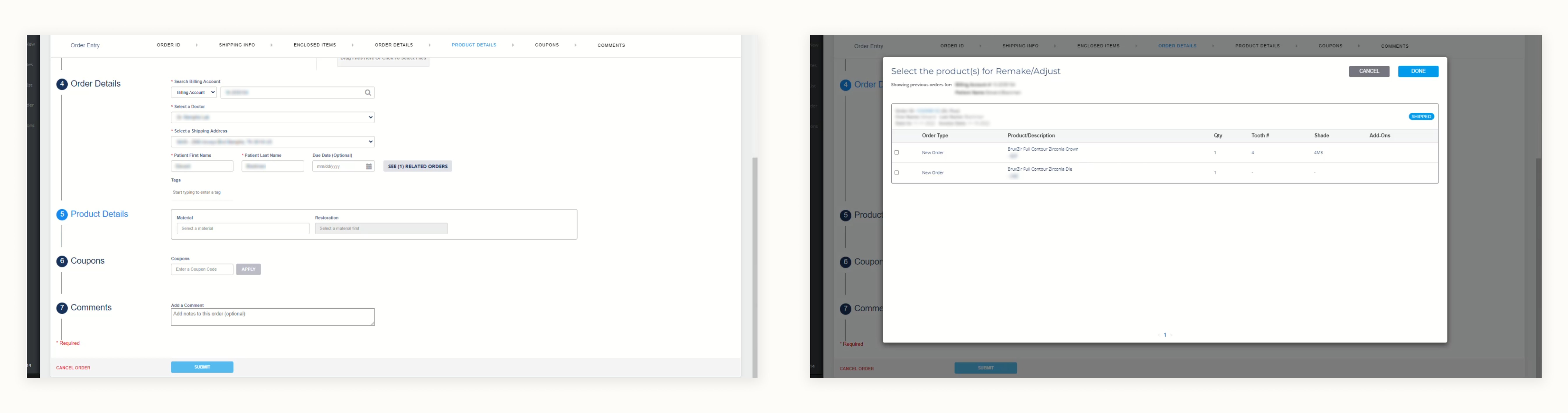
One of the legacy systems — the starting point for understanding the existing workflow
The familiar path
was the right path.
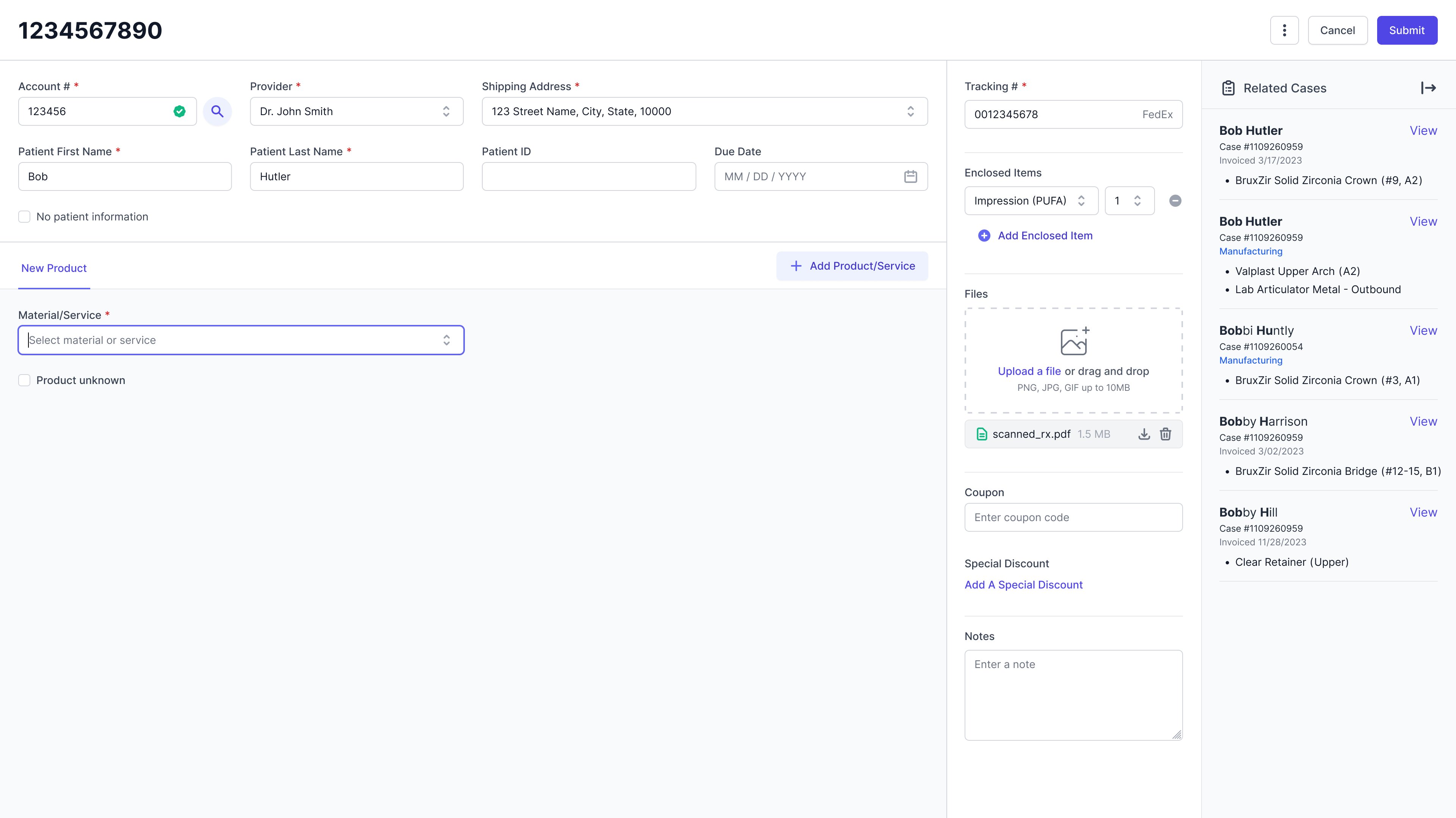
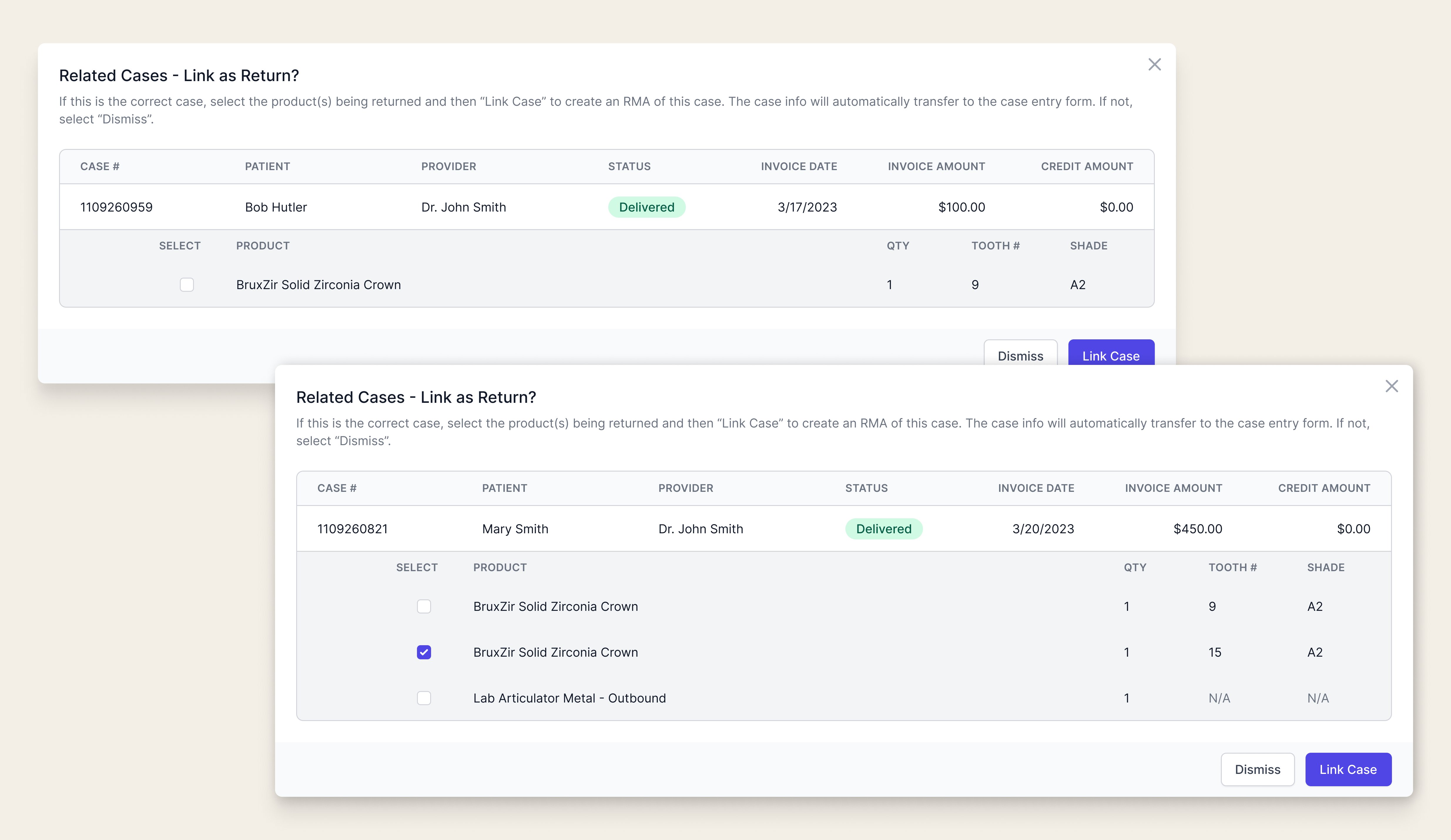
Linking cases wasn't just a technical requirement — it was a familiar anchor. Replicating the legacy system's case-linking pattern would help data-entry users transition to the new platform without losing the muscle memory they'd built over years.
A key component of creating returns is the ability to link related cases — a capability that had to be supported at case entry, just as it was in the legacy system. What started as a functional requirement became a hidden win: preserving a familiar interaction pattern gave users something recognizable in an otherwise new environment.
What made this hard,
and what I did
about it.
As the newest member of the team, I had limited understanding of the business and almost no familiarity with the design work done before my arrival. Getting up to speed quickly wasn't optional — the deadline was already close.
What I did: I connected with stakeholders directly to gain business context, and collaborated with fellow designers to review previous documentation and design decisions. The time investment gave me the foundation I needed to make informed decisions rather than assumptions.
Replacing a robust legacy system with an MVP is never straightforward — especially when the business workflow is complex and edge cases are everywhere. The scope had already been cut once, and I was designing within what remained.
What I did: I kept the first release in perspective: it's a starting point, not a final answer. I communicated regularly with engineers to align on what was technically feasible, making deliberate compromises that didn't close the door on future improvements.
Three structures.
One familiar answer.
I explored three approaches for surfacing related cases within the case entry flow, each balancing visibility, familiarity, and the complexity of the information being presented.
A color-coded banner alerts users when related cases are found, with a modal to view details. Familiar and space-efficient — but easy to miss, and the extra click to surface details adds friction.
All related cases displayed persistently in a side panel — no extra click required. More visible, but potentially overwhelming with a high volume of related cases and limited by side panel functionality.
Related cases shown in the side panel for easy scanning, with a modal for focused detail review when needed. Most similar to the legacy system workflow — familiar and scalable.
Exploration 3 won because it matched how users already worked. In a new system full of unfamiliar patterns, giving users one familiar anchor reduced cognitive load and eased the transition.